Creating logos for companies: the 11 rules for enhancing brand identity
Creating logos for companies: the 11 rules for enhancing brand identity
When we talk about creation of logos for companies it is crucial to think about what you want to communicate: what message do you want to send to your audience, and what values do you want them to associate with your brand?
The creation of a corporate logo It is indeed not just an aesthetic issue: a well-designed logo is the first element of contact between the company and the public, a symbol that should convey identity, values and mission at a glance. It is not simply a graphic sign, but a powerful communication tool that can strengthen brand identity and enhance reputation and recognition.
In fact, an effective logo helps a company to Stand out from competitors and to create an emotional connection with the audience: it must be able to withstand time, adapt to different applications and maintain its effectiveness regardless of the medium on which it is reproduced. Its design therefore requires a combination of creativity, technical skills and a deep understanding of the target market.
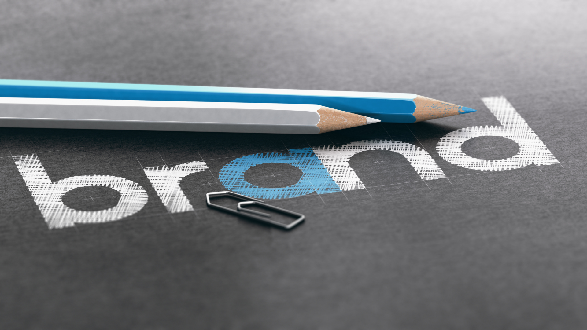
The logo: the first direct contact between your company and the public
Your company logo will be present in every aspect of communication: from website to product packaging, from promotional materials to store signage to digital channels and social media. Wherever your brand will be seen or recognized, the logo will play a central role in representing it.
It might look like a simple graphic element, but it encapsulates much more than you might think: it embodies The very essence of your business, reflecting your company values, the quality of your products or services, your target audience, the industry in which you operate, and even the history and personality of your brand. A logo is a powerful tool for connecting with customers, capable of communicating reliability, professionalism and uniqueness at a glance.
For this very reason, In creating logos for businesses, balance is needed: the logo must be innovative but also functional, it must capture attention without being too complex or confusing. Whatever goal you set for yourself, the creation of a corporate logo always begins with a deep understanding of the brand.
Logo as the true soul of your company
What is your unique value proposition? What audience are you targeting? What emotions do you want to arouse in your customers? What are your core values and mission statement? Understanding these elements is an essential starting point since the logo will not only have to represent them, but also Communicate them to the public in a clear and memorable way.
As brand specialists, the work of Red Apple is precisely to study the brand in detail in order to create a 360-degree communication strategy, of which the logo is one of the main elements. Through our experience, we have realized that the recognizability of a logo is often directly proportional to its simplicity.
Clarity and simplicity: the keys to a logo's recognizability
Simplicity is perhaps the fundamental principle to be adhered to when it comes to the creation of logos for companies: A simply and professionally created logo catches the eye and makes the brand memorable at first sight.
Indeed, a clean, linear design allows the audience to quickly identify your company and associate it with its values without confusion or distraction, whereas an overly complex logo, perhaps full of intricate details or with too many nuances, is likely to be confusing and ineffective.
Beware, however, of Do not confuse simplicity and clarity with banality and creative poverty. Instead, it is better to talk about essentiality and precision: every line, every color, and every element must have a specific reason for existing; it must communicate something and speak of your vision, what you propose to do, and what you want to offer with your business. Only in this way will the logo really stick in the minds of your audience.
Logo creation for companies: a mix of visual identity and audience expectations
When designing a logo it is important to think about the expectations of your audience: a good design must in fact immediately communicate the sector in which the company operates and is located.
For example, think of the high-tech enterprises which often use a minimalist design with clean lines and cool colors such as blue or gray to evoke modernity, innovation, and reliability. In contrast, a luxury brand might choose an elegant logo with refined fonts and sophisticated shades such as gold or black to convey exclusivity and prestige. At the same time, a business that deals with natural or organic products could focus instead on softer shapes and nature-inspired colors such as green and brown to communicate authenticity and sustainability.
Whatever the target industry, the logo must be totally in line with the corporate brand identity.
The logo should immediately make people think of your business
Simplicity promotes recognizability, but the real strength of a corporate logo is to be remembered at the very first glance: the more memorable it is, the easier it will be for people to associate it with the company and recognize it among many others.
Let us think about the most iconic brands in history: it is not the most complex ones, but the simplest and most thought-out ones that are remembered. Their branding is so effective that one glance is enough to recognize it even without reading the company name: for example, you don't need to read "Apple" under the famous apple to reconnect the image with the Cupertino tech company.
Not only recognizability and memorability, but simplicity also brings with it another advantage: The ease of adaptation to different formats.
Versatility of a logo: an aid to brand identity
An effective logo should work in any situation and on any type of media, from letterhead to digital platforms, from business cards to company signs, from social media to mobile apps.
The multichannel connection of modern brands leads the logo to become a real connection point between all the different applications of the communication strategy. Consequently, it must be designed in such a way that it always retains its recognizability and readability, regardless of the format or context in which it is used.
For example, it must remain effective even when reduced to a very small size, as in an icon for an app, or when enlarged on a billboard. Thus, simplicity plays a very important role here: the adaptability of a logo is an essential factor in building a strong and consistent brand identity. Creating a design versatile means ensuring that the brand can represent the company with the same effectiveness in any medium, thus strengthening its brand recognition and professionalism at every opportunity.
To make it so appealing, however, stylistic simplicity is not enough; it also requires a good balance between text and symbols.
Balance is still needed
In creating logos for companies, we can make some distinctions between monogram logos (written, as IMB), pictorial (symbols, like Instagram's camera) or a combination of both (the symbol of Burger King).
The choice among these options depends on several factors including your industry, branding strategy, and target audience: if the company name is short, unique, and easily memorized, a text-based logo may be sufficient to convey identity and authority, while a well-designed icon or symbol can reinforce brand recognition globally, making it more accessible even to those who do not know the language ofpay off.
In most cases the combination between turns out to be the winning choice as long as it is done carefully, so that each element works in synergy with the other, avoiding redundancy and overlap.
Creating logos for companies requires balance as well as originality
Exactly as we have seen for simplicity, balance also does not mean triviality and lack of creative verve. As communication agency with over 30 years of experience in creating and brand management, we know that the clarity of the logo and the right balance must still have one thing in common: originality.
In fact, a logo's main purpose is to Represent the uniqueness of the company, differentiating it from competitors and making it instantly recognizable. If a logo is too similar to those of other companies or follows passing graphic fashions, it risks quickly losing effectiveness, becoming obsolete or blending in with other brands.In this sense, the use of unique shapes, colors, and fonts helps the brand to imprint itself in the minds of the public and to build a solid brand identity over time.
La creativity therefore plays a crucial role in the creation of an original design, but it must also be guided by a clear and coherent strategy.This leads us to briefly discuss the Color psychology.
Every color has a meaning: use it to enhance brand identity
Since the earliest studies of the influence of colors on human emotions, marketing has exploited this quality for its messages. A certain type of color stimulates, according to psychology, a certain reaction or emotion in our brain, thus also influencing our behavior and perceptions.
The importance of logos is based on both on both recognizability and the emotions they arouse in the audience, choosing the color for one's brand is consequently a key step. For example, the brown and the green recall nature and the outdoors, the blue conveys reliability and security, while the red is the color of passion, impulsiveness and romance.
Color is a component on which to pay enormous attention when creating logos for companies: based on mission, values conveyed, scope and target audience, color choice should be consistent with corporate identity.
The font or typeface is also critical in creating logos for businesses
The font, i.e., the choice of typeface, is one of the most underestimated but crucial elements in the creation of logos for companies: it's not just about choosing a font you like, but thinking about how the font you choose can Communicating your brand personality and values.
In fact, each typeface has its own personality: a font sans-serif clean and modern evokes minimalism, innovation and technology, while a character classic serif invokes refinement, tradition and authority. Similarly, a font script that imitates handwriting may communicate creativity or craftsmanship, while a bold font It conveys strength and reliability.
But in addition to the emotional aspects, the font must also always be readable in different formats and in any size and medium, from business cards to web and social applications.
Update in the name of continuity
Evolution is part of the natural growth of businesses, following the market and adapting to new public needs. However, when updating or modifying your logo, always remember to incorporate Gradual changes that respect the already established historical and emotional roots: Staying authentic and modern over the years is most useful both for consolidating and strengthening brand identity and for approaching new markets and audiences.
Think, for example, of automobile brands such as. Ford e Volkswagen: since their founding, they have adopted an increasingly minimalist style to stay in step with the times, yet never stray too far from their tradition of efficiency and quality.
Design in the service of brand identity? Here's what it takes to remember
As we could see, a logo is more than just a design: Is a symbol that conveys your company's values and is part of a successful marketing strategy. Above all, it is the first thing your customers see about your company, and that is precisely why you need a design with simple lines and a few but eye-catching colors to make it memorable at first impact.
In addition, it must always Respect your identity , and if possible, communicate it at first glance without losing effectiveness in the various sizes and formats, both printed and digital. Finally, you need a design that knows how to maintain its originality over time without becoming a slave to the fashions of the moment.
View The importance of branding in your corporate communication, make an appointment with the professionals at Red Apple International! Our brand specialists are continuously updated on the latest in graphic design, design and web marketing so as to provide you with the highest quality service that can give true light to your logo.