The importance of infographics and 11 examples for inspiration
The importance of infographics and 11 examples for inspiration
Among the tools used in modern visual communication, infographics play a relevant role. These charts are mainly used in the field of journalism and information, where the administration of important and complex data needs to be simplified to aid reader understanding.
Infographics become very useful especially in the modern landscape, where the drastic drop in the public's attention span requires increasingly incisive and targeted techniques to maintain interest. In addition, the enormous amount of readily available and immediately searchable data is unparalleled in human history, and communication experts must constantly find new ways to make the most of it. If well designed, an infographic is decisive in increasing comprehension, stimulating interest and improving content memorization.
Simplifying and illustrating the concepts, these combine numerical data, graphics, pictures and brief descriptions to create an immediately understandable visual representation, they allow information to be made accessible that might otherwise be difficult to interpret through text alone.
From marketing to education, from health to technology, infographics prove to be of paramount importance in all fields where the communication of data and information plays a central role.
Infographics and their rules: effective and targeted communication
This methodology of information transmission is truly ingenious, not least because it can be adapted to different audiences and platforms, increasing versatility. Infographics can be used to illustrate statistics, processes or abstract concepts, making information not only more usable but also more engaging.
La publishing platform, whatever it may be, does not affect the usability of the information in the slightest; on the contrary, it is perfect even in environments such as social media, where conciseness is essential to keep the user's attention.
The human brain, moreover, Memorizes images more effectively (understood here as diagrams, charts and graphs) as opposed to a series of serially written symbols. The combination of these two methods of communication (words and pictures) contributes to the greater usability of information.
Infographics, have no strict rules for their creation. Each editor can use the display system he or she prefers, the graphics he or she prefers, and the best design. In fact, there are many different examples of infographics on the web, all of which are extremely focused and specific. While it is true that an exact pattern does not exist, the same cannot be said of guidelines. One can play a lot with the design and the system of representation, but an infographic must still meet certain parameters and possess certain qualities to be, in the end, not only graphically pleasing but also useful to the reader.
Clarity, simplicity and use of colors
A successful infographic is first distinguished from the clarity of message conveyed. Data should be presented in such a way that even those who are not absolutely familiar with the subject matter may be able to understand its meaning. Using intuitive symbols, short text and a logical layout helps convey the message without overloading the audience with superfluous details. Overly detailed infographics risk losing sight of the main goal: to make the information immediately accessible.
Clarity and simplicity can also be defined as order and cleanliness. Infographics should not try to convey too much information, which could instead confuse and deaden the reader. Every single element in the charts must contribute to the understanding of the message and must have a reason for existence. Whether we are talking about colors, graphics or icons, everything should be chosen to reinforce the concept, not to add confusion.
Colors are one of the main aspects in the creation of infographics. Indeed, the author must be very careful not to visually overload the project, which would make it heavy and difficult to consult. The use of contrast is very useful, but the harmony between different shades must also be taken care of. Colors should also have a semantic meaning. For example, red to signal urgency or danger, green for success or safety. There are no precise rules, but a minimum of work on the graphic design is necessary for clear and easy-to-understand infographics.
Data completeness, balance and visual hierarchy
Bar graphs, pie charts, concept maps or timelines. The method of presenting data in an infographic can change drastically from one project to another. The choice of the correct visualization is therefore crucial, and must be adapted according to the type of information to be represented. Graphs should aid the reception of information, not complicate it further.
Using infographics does not mean delete the text completely. Symbols and images serve to support the understanding of the message, not completely replace words, which must therefore be condensed, concise, clear, and complete with all necessary information.
Finally, of paramount importance is the visual hierarchy. The architecture of the infographic should follow a precise logic, so as to convey the eye from the most important information to the most marginal information. For example, the most important information should be highlighted through different sizes or colors.
11 examples of infographics from which to take inspiration
Over the years, each of us has certainly had to deal with infographics. University tracks, periodicals, and news sites have been using these representations for years now to convey messages and explain complex data. Finding examples that are truly virtuous, however, is different.
1. Considering the Season - Hickory farms

This infographic is used as an example on the Hickory farms site, one of the best in the world for data management and analysis in online communication. This graphic makes perfect use of visual comparison and the use of color harmony to explain the differences between the Existing types of wine.
A rule of design is "less is more," and it is used impeccably here. In this example, there is little data and it is presented clearly and simply. The information presented is explained with few images and little text, but even those who are not wine experts can perfectly understand the relationship between the various types
In four lines, everything is clearly explained. This is a very clear example of a perfect infographic.
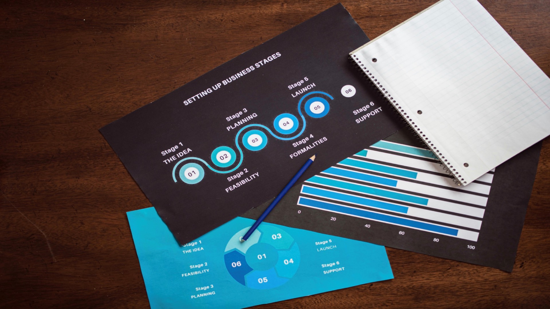
2. How to make money - Entrepreneur

The infographic is very simple: how to make money. Each stage of startup creation is represented through a well-structured timeline diagram. Different icons and colors for each section make the information easy to navigate. Text is kept to a minimum, with essential and practical information.
The same degree of color is always used, purple fading to blue for stylized images of people. This choice promotes linearity of the concept and information, as well as making it easier to read.
3. The Solar System - NASA
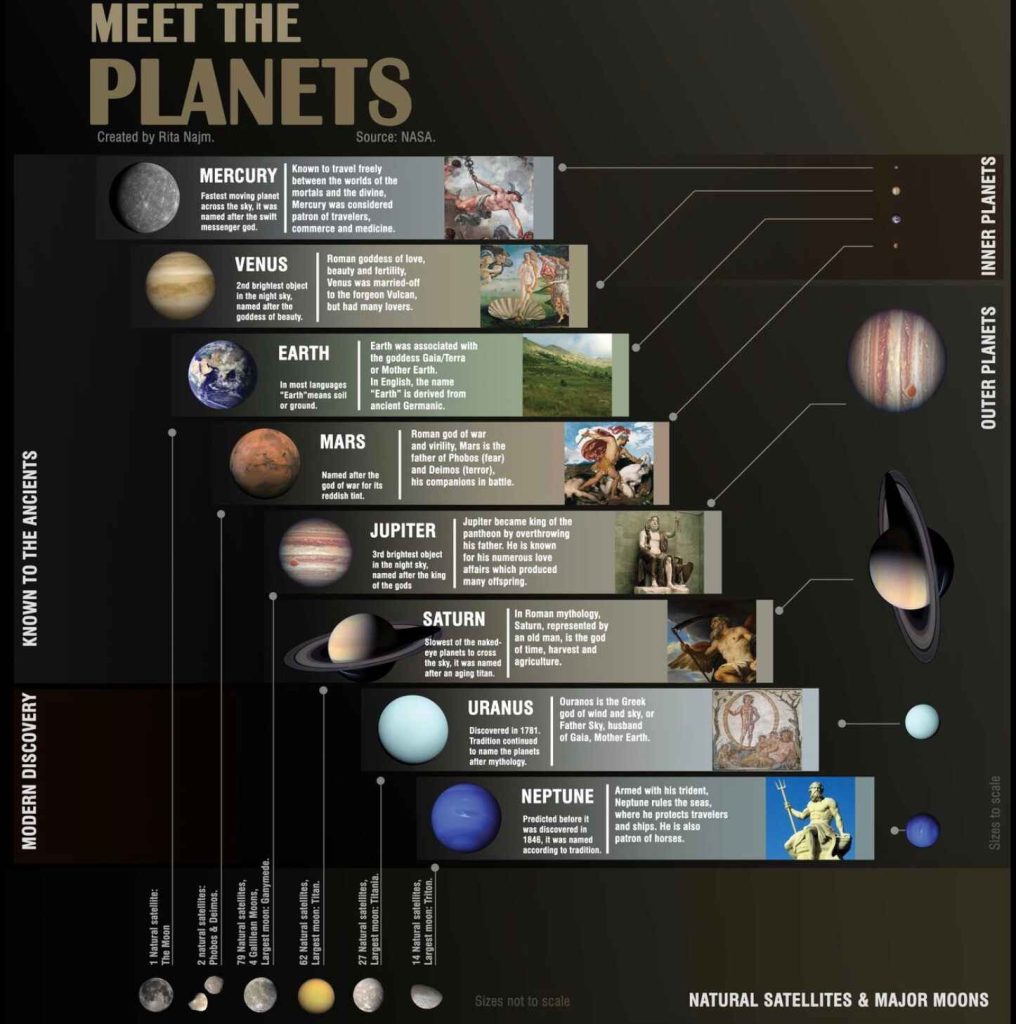
Here is another example of a successful infographic, in this case we see a scheme developed for the NASA, which explains the relationship between the planets in our solar system and their Greek/Roman mythological value. Here is a clear example of an infographic designed to generate traffic and engagement.
The beauty of this graphic lies in the alternation between renderings of the planets made with modern rendering technologies and the use of works of art to talk about the myth.
The infographic also includes, in an unobtrusive and visibly appreciable way (the images on the bottom left, ed.) additional trivia to the main information about the cries.
4. The Global Water Crisis - Water.org
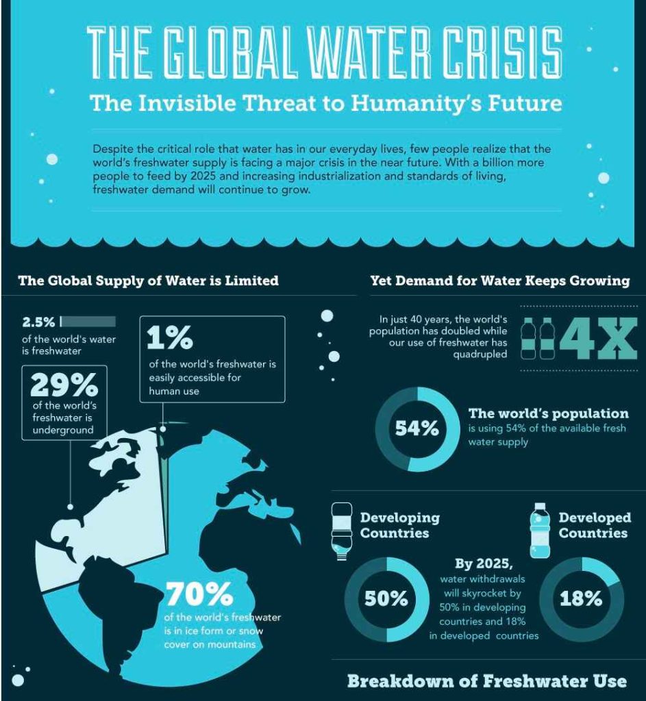
An infographic highlighting the global water crisis, using visual data to show water scarcity in different areas of the world. Pie charts and regional maps are accompanied by clear and powerful statistics, using blue as the predominant color to symbolize water.
It is a huge and specific 'infographic, which can be seen in its entirety on the official website of water.org. This is a project specifically for web consultation, and therefore can use a significant space.
The rules are different for print media, where there is more reward for specificity to a particular area (e.g., water shortages in cities, or water availability in a specific area of the planet).
5. Viral vector vaccines against Covid-19 - European Vaccination Information Portal
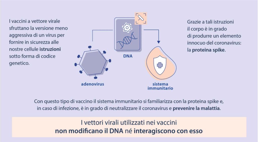
For the infographics of health character, clarity and simplicity are the first rule. These types of charts usually prefer greater use of text than images, which are only outlines.
The delicacy of this data, at a time in history when social media gives rise to a flood of conspiracy and false theories, requires information that is very easy to read and difficult to interpret.
Clarity is the main quality of these infographics, which must provide a huge amount of complex medical data in a simple and clear way.
6. The ultimate SEO checklist - Skillz me

This infographic summarizes the main SEO strategies concisely, using a combination of graphics and text. The steps are numbered, and the columnar design guides the user through each step of the process in a visually clear manner.
The various shades of color are used to differentiate different types of SEO strategies.
7. Tips to improve your memory - Elearning

The infographic provides practical suggestions for improve memory, using simple icons and a list-style layout. The clean and uncluttered design, using muted colors, makes it easy to read. Each suggestion is accompanied by a brief description and a relevant icon, which visually supports the concept.
It is one of the simplest and most effective methods of transmitting data of an informative nature. This kind of content is designed to be consumed calmly, perhaps in a coffee break or a moment of relaxation. The simplicity of the information, its organization by list and the use of soft colors creates an atmosphere of calm, peace and comfort.
8. Climate Anomalies 2019 - Climate Change Resources
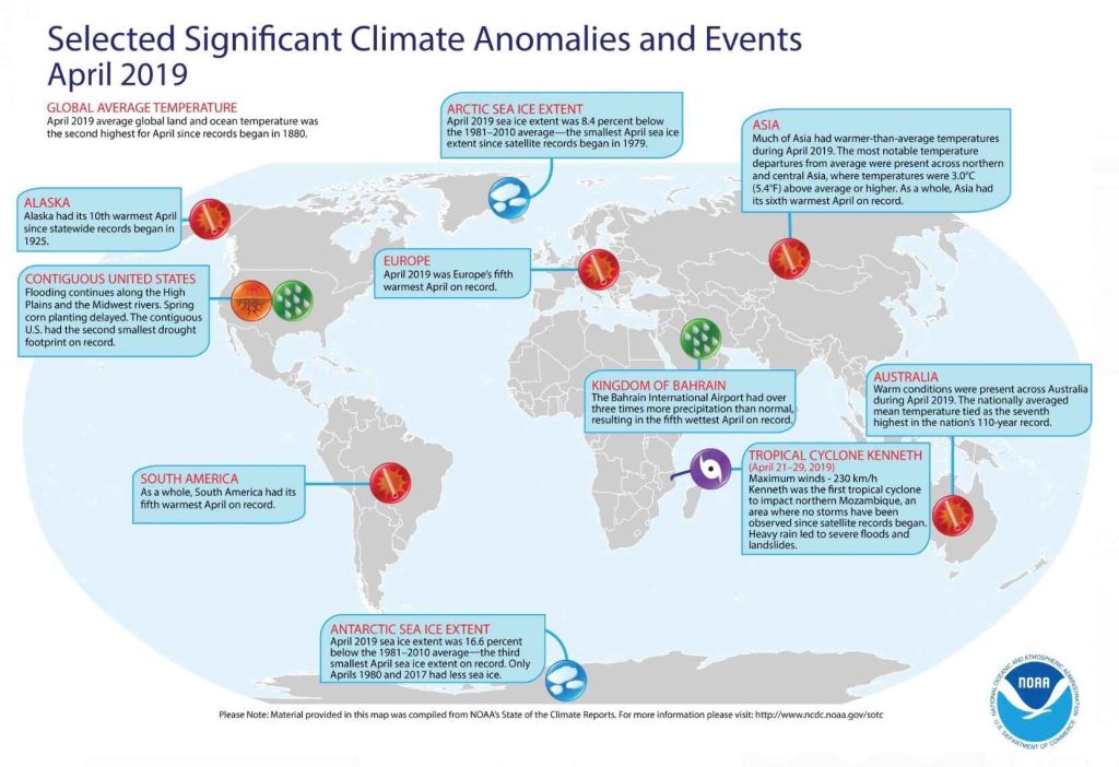
This infographic refers to the World climate situation in 2019. Specifically, it talks about the various climate anomalies that have appeared in different regions of the world. The anomalies refer to the increase in perceived temperature on the various continents.
Data of this kind are perfect to be represented through infographics, as they give a complete overview of what is the true situation over an enormously large territory.
9. Cigarette Taxes - Intuit Turbotax

The topic is very sensitive, the infographic much less so. This one explains the increase in state cigarette-related taxes in the United States from 2002/2010.
The data are illustrated through the use of a perfect combination of images and text. The use of such strong images promotes the assimilation of the message. Longer cigarette=higher taxes.
The choice to use images of real cigarettes over graphic realizations is intentional. The image of the object itself, especially when so divisive, helps a strongly negative association with the product.
10. Infographic of infographics - Grafigata.it
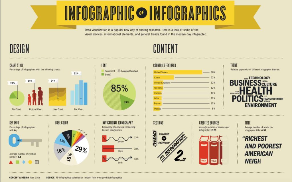
The rules to be followed in an infographic? We explain it in an infographic, of course. Made by grafigata.com, it explains in detail what needs to be in a successful infographic.
The main rules are explained through the use of a clever mix of text and images. The soft background helps focus the main concepts. These are conveyed to the mind of the audience through the use of colors and icons.
We wanted to bring it back because, precisely, this article could be summarized in this infographic. If this is not the perfect example, we really wouldn't know how to render it better.
11. Gender Stereotypes - Istat
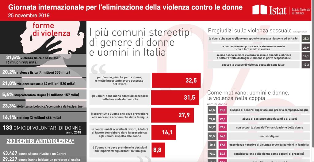
Infographics can be used to explain complex topics and divisive data. The gender-based violence is one of the main problems of Italian society in the 21st century. Just as has been done for climate and water, modern issues need to be explained with modern methodologies.
This infographic favors textual content over visual content. The reason is the enormous amount of data this table conveys. For the subject matter, it turns out to be the best strategy.
Infographics are just one of the strategies for effective web communication. Our team of professionals will be able to respond to all your needs. Every aspect of communication can be handled by the team of Red Apple. Contact us To find the best solution for your needs.