Accessible and intuitive: Red Apple signs Como Acqua's new website
Accessible and intuitive: Red Apple signs Como Acqua's new website
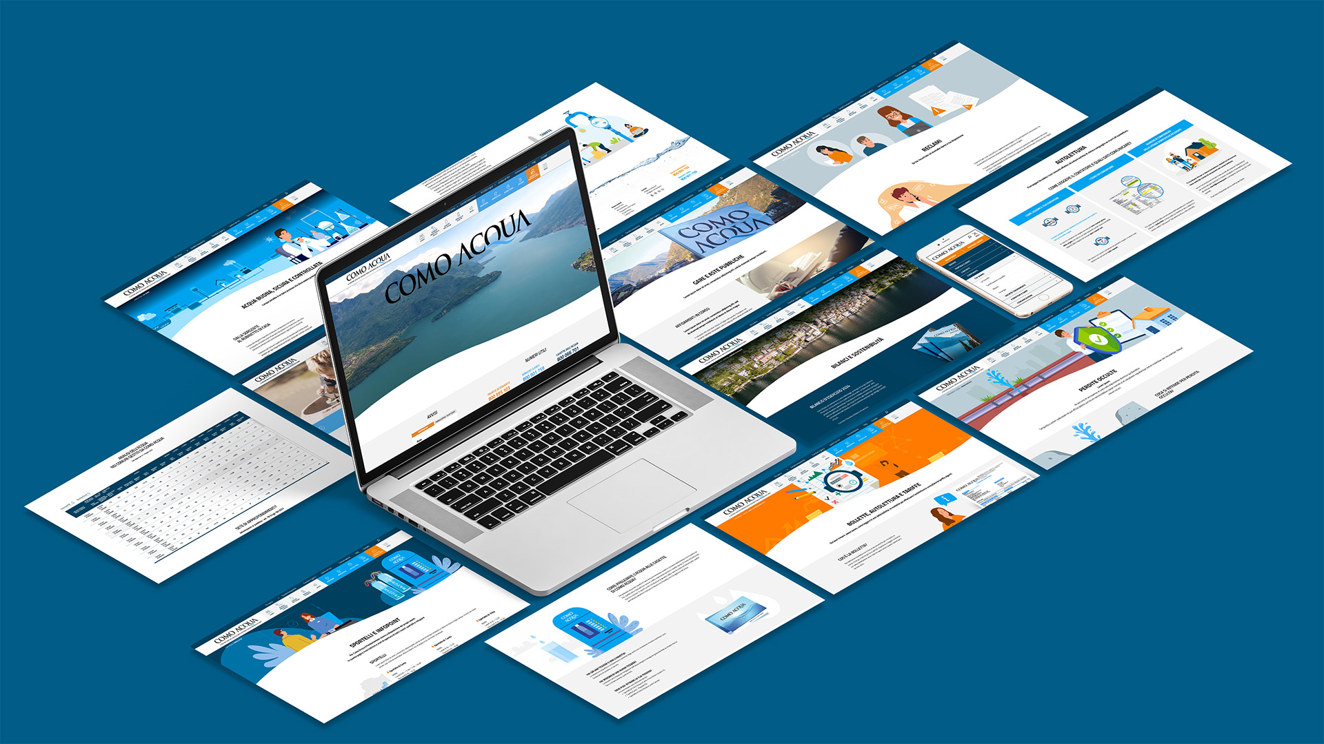
Making simple what is complex: this was the challenge behind the design of the new Como Acqua website, the sole manager of the integrated water service in the province of Como. It was a challenge we took up enthusiastically, working side by side with the client to develop an accessible, functional and intuitive digital portal designed for an extremely wide and diverse audience.
The site, designed and developed by our team of professionals, is the result of a fellowship and constant dialogue with Como Acqua.
The goal? To shape a tool capable of meeting the needs of all users, from those unfamiliar with the digital world to those who use it every day.
Easy navigation, clear information, "friendly" appeal
Following the most up-to-date principles of UX/UI design, we have structured a true portal in which navigation is smooth and immediate. Information-often complex or bureaucratic-is now easy to find thanks to a menu structured to guide the user to what they are looking for in just a few clicks. CTAs have been strategically arranged, anticipating the most common searches (such as assistance, forms, self-reading) and accompanying the user every step of the way.
The interface has an aesthetic we like to call "friendly." Intuitive icons, explanatory custom illustrations, and a distinctive color palette help make the browsing experience clearer and more pleasant, even when it comes to bureaucratic tasks such as filling out forms or consulting documents.
The home page opens with a full-screen emotional video (with the exception of the main CTAs), which recounts the entire water cycle-from the source to our homes-through familiar scenarios: those of the province of Como. A way to strengthen the link with the territory and the community, a distinctive note of Como Acqua.
Timely content, always just a click away
Each page is designed ad hoc, with the goal of simplifying the user experience and reducing the time it takes to search for information.
Visiting the site www.comoacqua.it, it is now possible to access all major services within seconds:
- contacts for assistance
- Map of infopoints and water houses (integrated with Google Maps)
- updated forms
- Self-reading guide (also in video format, made by us)
- ... and more.
The stakeholder and institutional partner sections were given a more formal approach, without sacrificing visual effectiveness: real photographs, infographics, corporate data, and a clear, hierarchical structure were the keys to communicating with greater authority, without losing clarity and accessibility.
Accessibility is really the key word of the project. The new Como Acqua website is, in fact, fully compliant with the latest regulations on digital accessibility (European Accessibility Act): every content, every element, every tab, every page is designed and implemented in such a way as to be usable by anyone, in any condition.
In summary, this project reflects the shared mission of Red Apple International and Como Acqua: Putting the end user at the center, making communication a tool for simplification and inclusione.
The activity for Como Acqua does not end with the website!
See the dedicated portfolio to learn more.