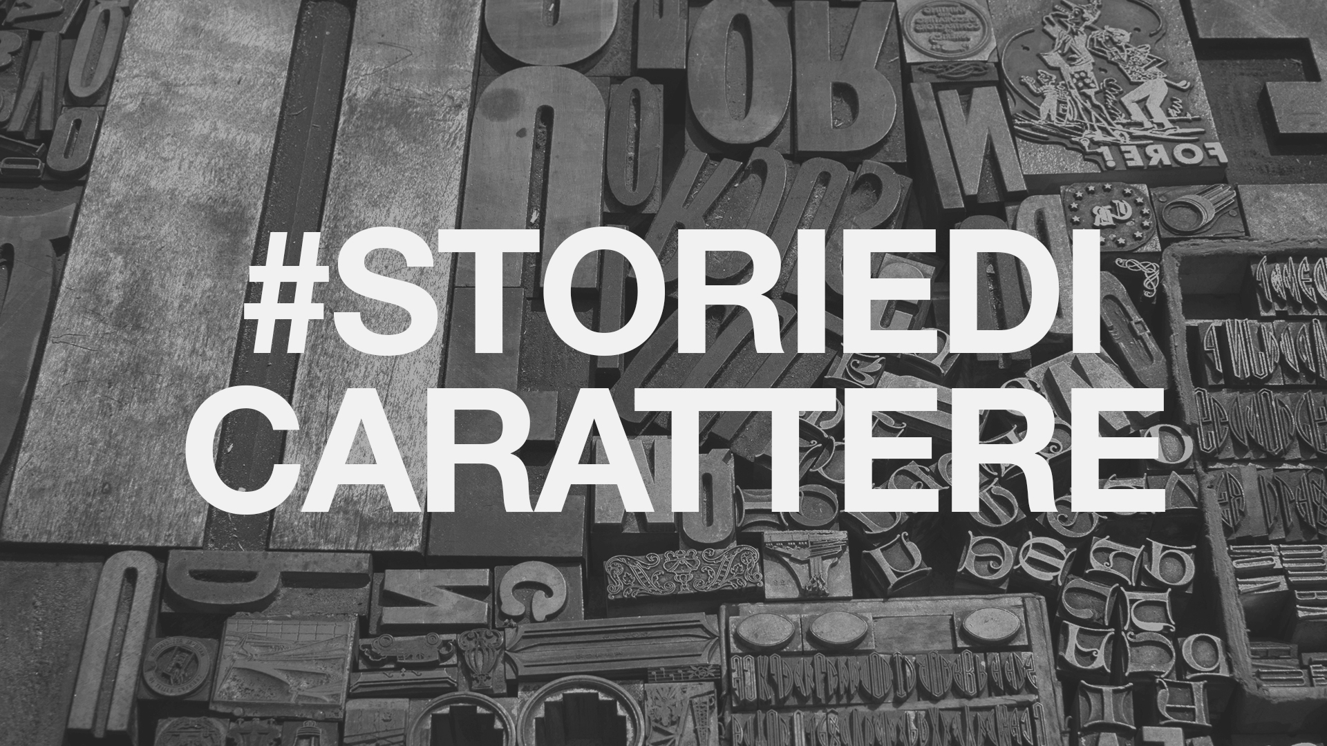
The choice of a character with much weight, in the former case, does not support the meaning of the word and conveys to us a sense of solidity; on the contrary, using a character calligraphic with sinuous lines and fine strokes, helps transfer the meaning of the word, namely lightness, to the reader.
This is the concept for our calendar 2021, which will be available soon: playing with the double meaning of the term "character", retrace the histories of some of the fonts most used by graphic designers and, through motivational phrases, make you pause for a few moments--because, sometimes, a "character" attitude can be a spur to guide your choices, your destinies.
At the same time, on our social channels, we will tell you about the connection that exists between personality, brand and typeface chosen.
Ready to embark on this journey with us? Let's set off then!
First, a clarification: typeface VS font
How many times have you used the term "font" To define, for example, Helvetica or Times New Roman?
It is now common to use "font" as a synonym for typeface: in the slang everyday we define "fonts" as all those that appear to us in the famous drop-down menu of any program that involves text. In reality, however, there is a profound difference: here is the first interesting fact you will learn today!
Typeface identifies a set of characters designed to have the same visual appearance;
font is instead the tool, the file that enables the display of the typeface (derived from source in French and font in English, used to refer to the metal plummet with which it is printed).
So: Helvetica is the typeface, Helvetica Italic Bold Is the font.
All clear? We can go ahead then!
From the birth of printing to... Comic Sans
Yes, we dared to pronounce THAT name, the "he who must not be named" of the graphic design world... but there is a reason: "he" is also a key part of the story we are going to tell you, so wait to judge him!
So let's start from the beginning: the evolution of the typefaces is closely intertwined with the history of printing. Before 1450, when Gutenberg gave birth to movable type printing, the only mode of writing was by hand; only with the arrival of the Blackletter so we can really talk about typefaces.
Initially, printing was inspired by handwriting and Gothic fonts, which appeared, however, to be barely legible: this is when the fonts arrived Romans. One example is Cambria, dating back to 1500 and invented by Jenson: immediately loved for its light and elegant lines, it is still one of the most widely used.
The characters that emerged in later years, up to the mid-1800s, can be divided into three macro categories:
- Oldstyle: Little contrast between curves and lines and thick graces.
An example? Caslon, whose eponymous inventor also created the characters Sans Serif. - Transitional: thinner thanks and high contrast between curves and lines.
It is part of it Baskerville! - Modern: very subtle graces and high contrast between curves and lines.
These include two of the best known: Didot and Bodoni
With the explosion of the Second Industrial Revolution then, new communication needs arose, which were expressed by a real "revolution" in the world of typography as well: letters became taller and with greater weight. One of the results of this experimentation is the birth of the Egyptian: slab serif with very pronounced graces, such as Rockwell.
We are getting closer and closer to our time!
We finally arrive at the last century: the following are born Future and Akzidenz Grotesk (ancestor of the more famous and beloved Helvetica). Futura, also called Geometric Sans, was an immediate success: it is very clear and regular, because it is based on geometric figures (circle, triangle rectangle) that give it symmetry. At the same time in England the designer Gill creates a new font: Gill Sans, similar to Geometric Sans but with more harmonious and natural curves, giving it the designation of Humanists Sans.
1957 is the year that no graphic designer can forget: theHelvetica. Its curvaceous curves, elegance, simplicity, and the power of declining into multiple versions with different weights have made it the most beloved by designers of all time, and also our favorite!
With the arrival of computers, typography also changed: initially we find the Pixel Typeface, consisting of the union of several pixels, but thanks to technological evolution we come to have the ability to either create new fonts from scratch (such as Comic Sans) both to put the "classic" fonts into digital and use them.
What about today? With the power of the tools we have at our disposal, anyone can create a typeface and customize every aspect of it: in fact, more and more people are custom characters, created specifically for a brand.
Let's make 2021 an unforgettable year: our calendar is coming!
Keep following us to find out when it will be available and all the trivia about it ... a little sneak peek: you'll find it all in our section news!

Recent Comments