Reposition the brand, redefine corporate identity, strengthen brand reputation.
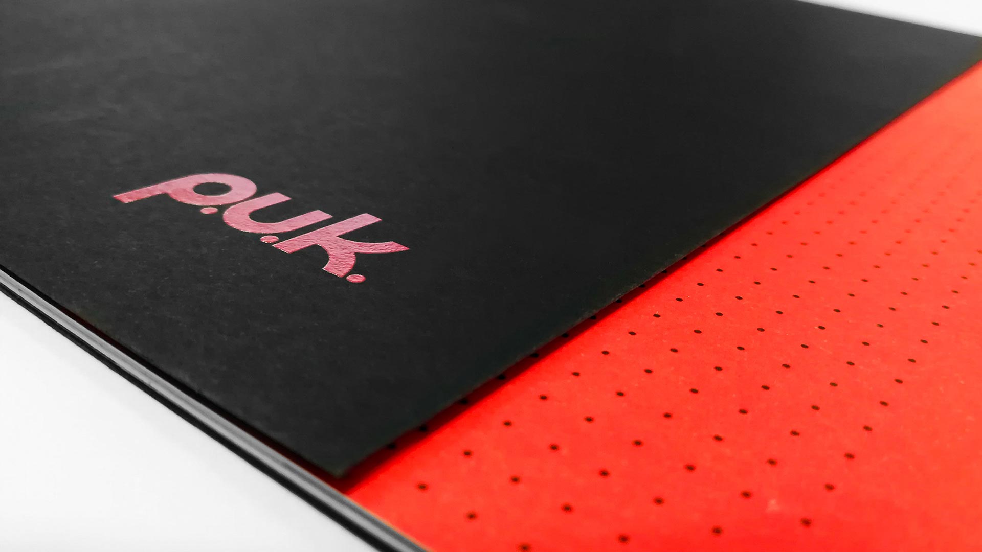
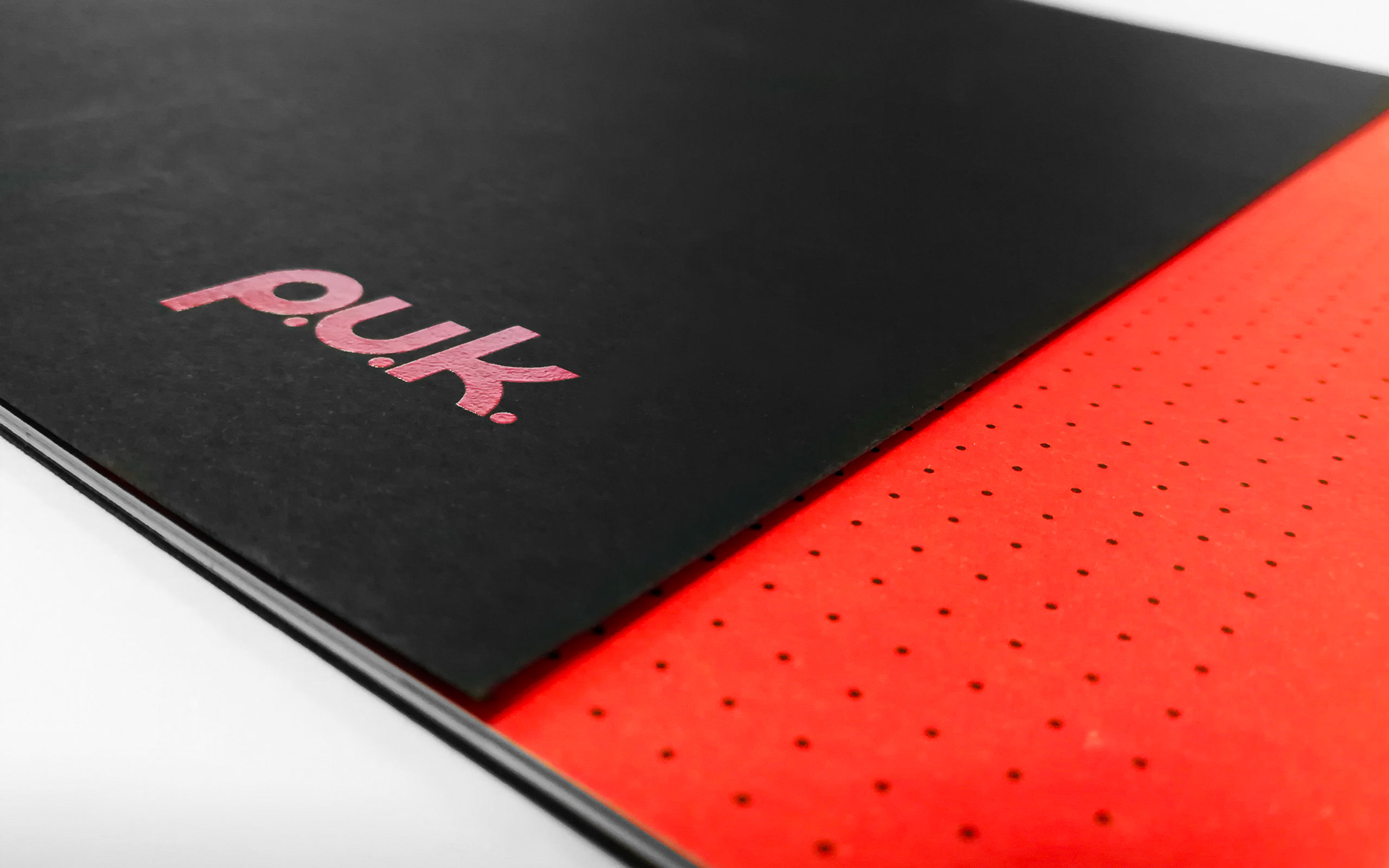
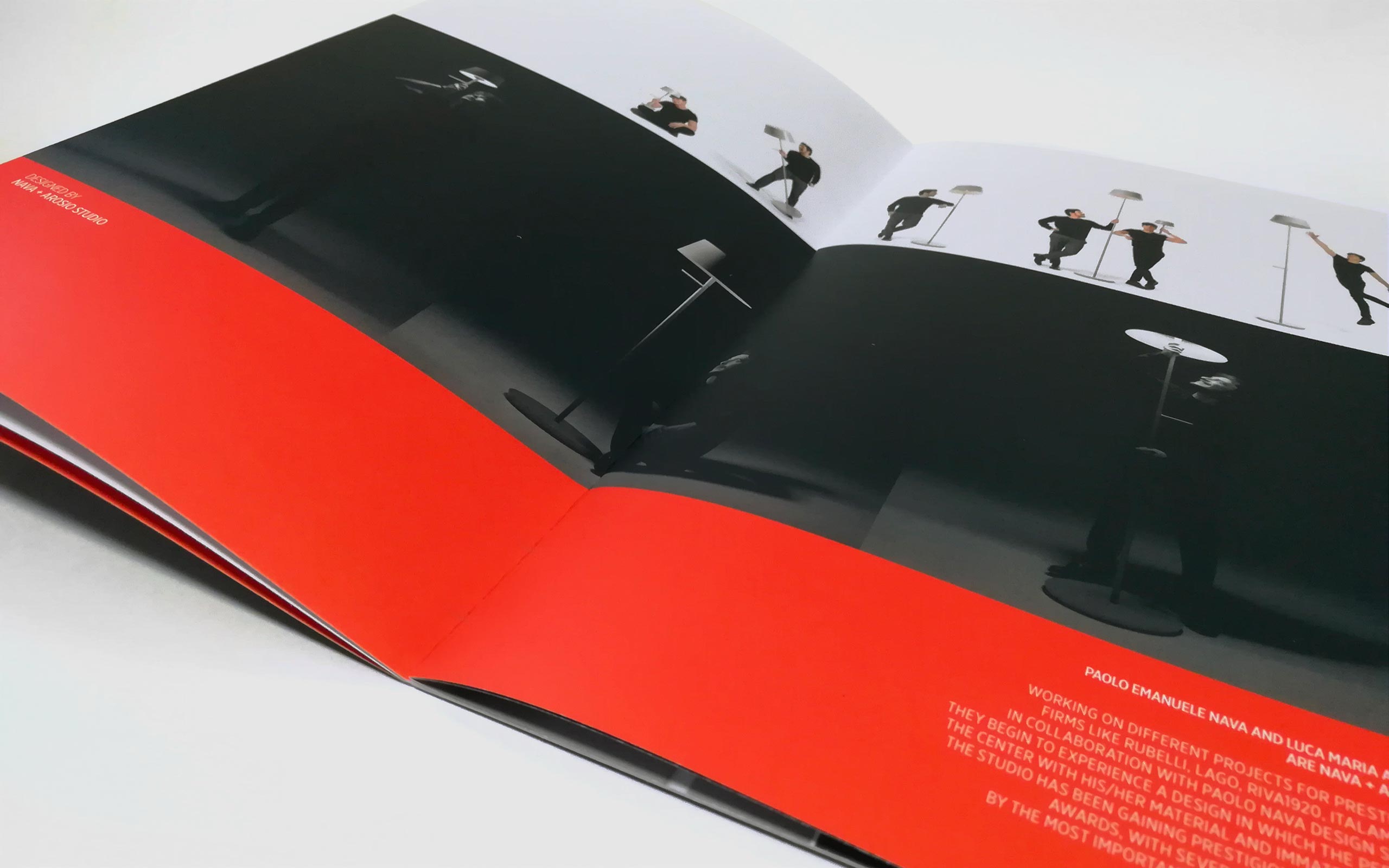
Generating content to create communication tools from an integrated and comprehensive perspective. The key turning point is the identification of a color that becomes the visual protagonist of a profound transformation that has taken place within the company.
FOREWORD
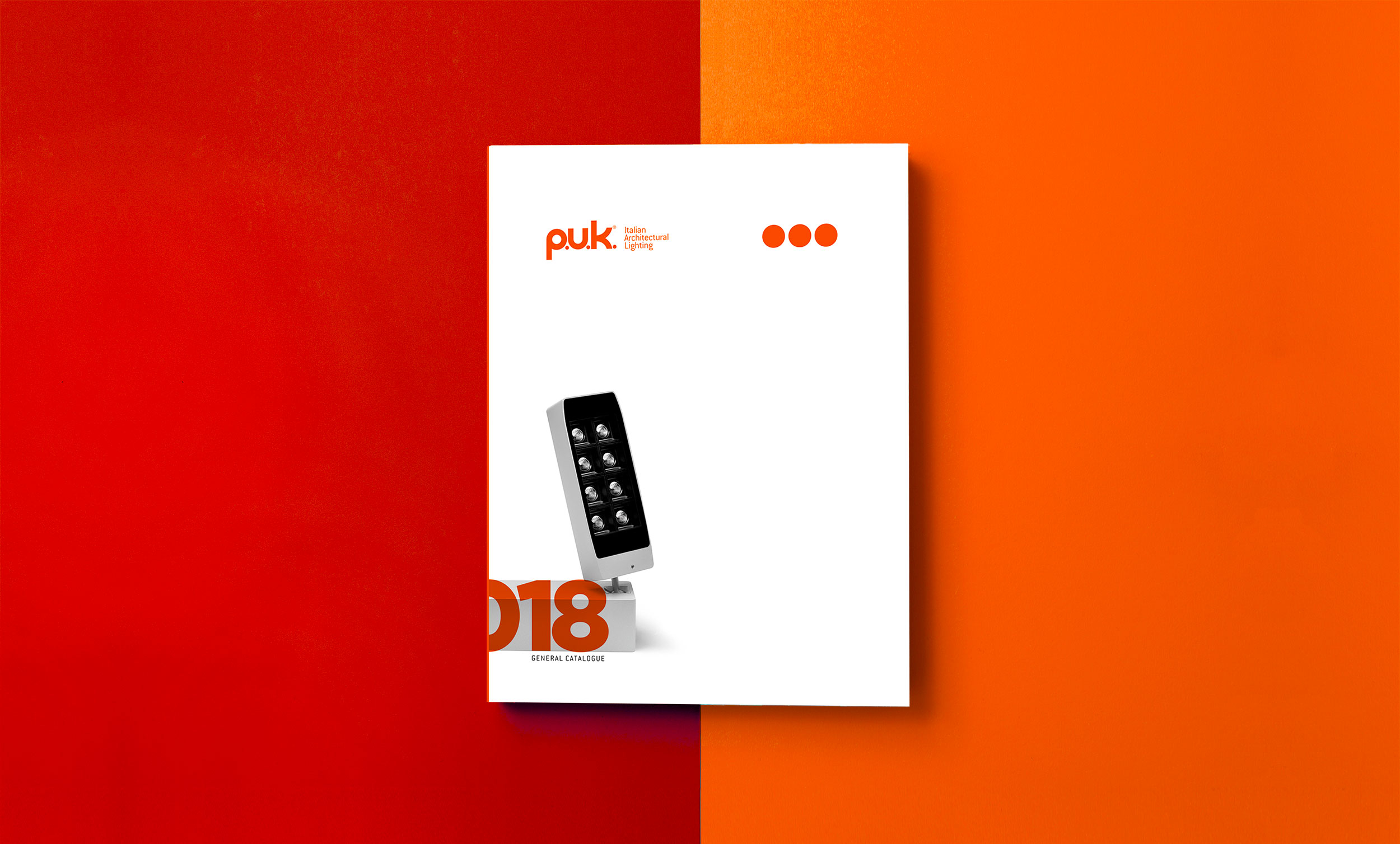
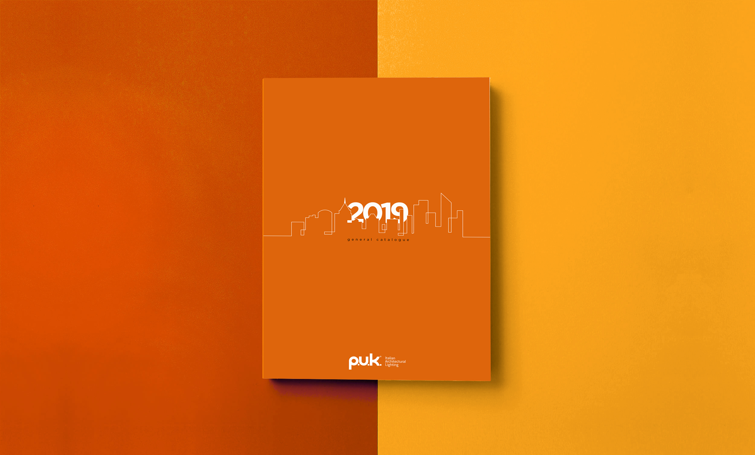
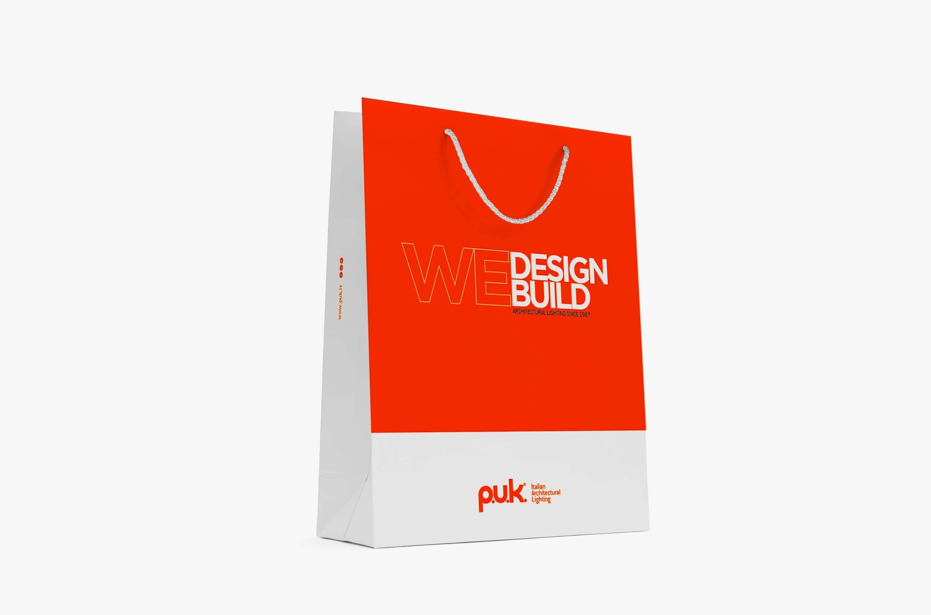
PUK Italian Architectural Lighting, manufactures technical lighting fixtures and systems, choosing to focus on outdoor architectural lighting, this area requires very high technological production characteristics and use of specific materials to ensure long life.Over the years, the company has grown and expanded its client audience, coming to work in international markets with a focus on the Middle East.Today, PUK, strengthened by its well-established reputation as an industry player, needs to revise its identity in order to arrive at a more effective dialogue with a segment of the market that is more sensitive to architectural designe issues in both a technical and decorative sense.
NEED
Strengthen brand reputation in the field of expertise. Reposition the brand, redefine the corporate identity and consequently revise the communication tools from an integrated and comprehensive perspective that can convey the new image, more essential clear and contemporary.
SOLUTION
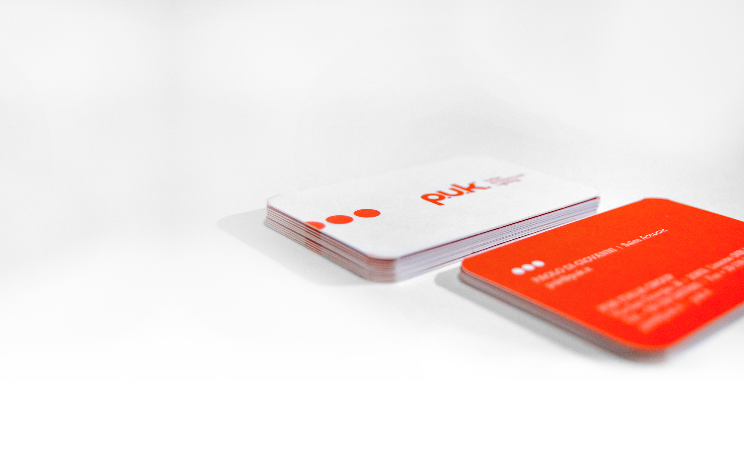
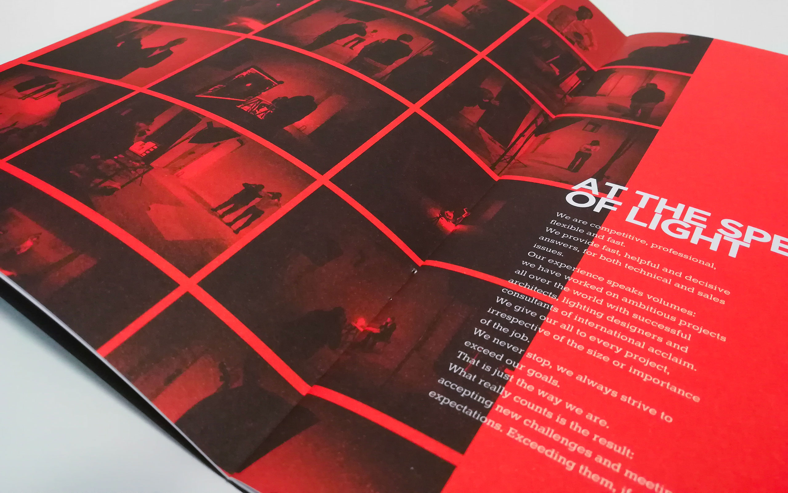
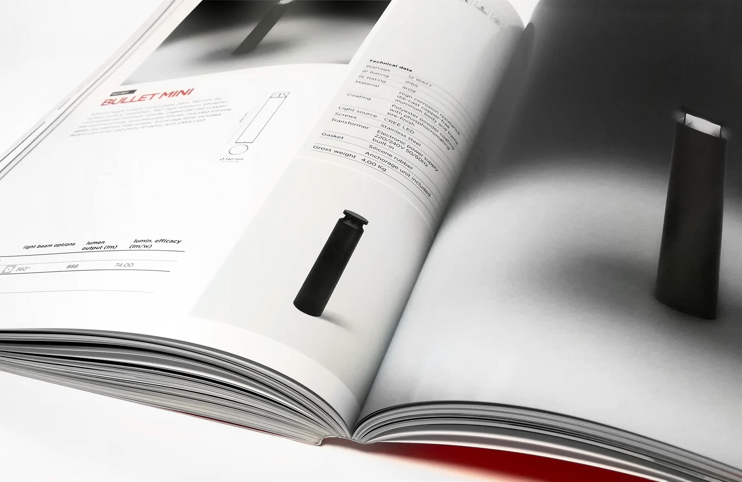
The corporate identity and all branding activities were carried out while maintaining a common approach appropriate to the image intended to be disseminated.This particularly benefited the clarity of communication, and the more immediate possibility of recognition (distinction from competitors). A coordinated image in every tool made it possible to support the desired positioning and give additional prestige to the brand.